Some builds are not about complexity.
They are about momentum.
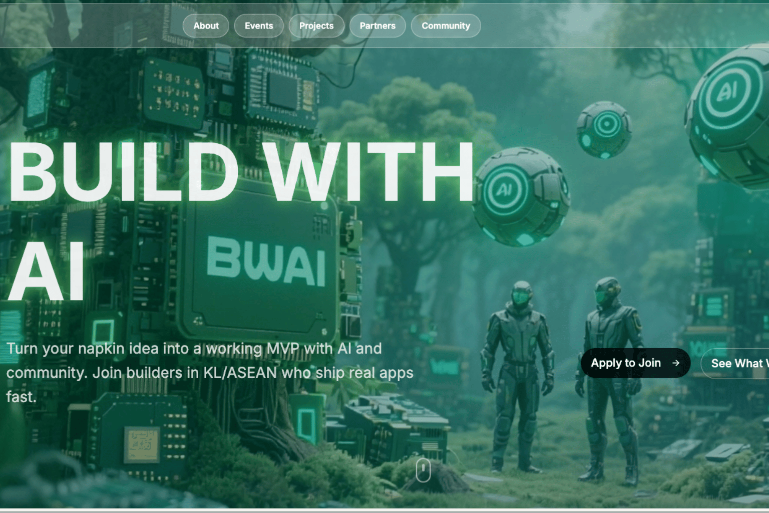
On April 5, 2026, I joined the challenge to build a landing page for Build With AI — or BWAI — a KL and ASEAN builder community bringing together people who are learning, experimenting, and shipping with AI.
The brief was simple:
Build it in one session.
Make it real.
Ship it live.
That kind of constraint is useful.
When there is only one sitting, you cannot overthink every section. You cannot spend three hours comparing fonts. You cannot hide behind “I will polish it later.”
You need to decide what matters, build around that, and keep moving.
The Starting Point
BWAI already had the most important thing a community needs.
Energy.
The community had more than 150 members and over 20 shipped apps from builders in the ecosystem.
That mattered because the landing page did not need to invent credibility.
It needed to show it.
The job of the page was not to say, “This is a community that builds.”
The job was to make visitors feel:
These people are already building.
Maybe I should build with them.
That became the central design direction.
Not a corporate page. Not a generic event page. Not a placeholder community page.
A builder landing page with proof.
The Stack
For this experiment, I kept the stack simple:
v0 by Vercel
Next.js
Tailwind CSS
Vercel deployment
v0 handled the rapid UI generation.
Next.js and Tailwind gave the page structure and styling flexibility.
Vercel made deployment almost immediate.
The goal was not to build the most advanced technical architecture.
The goal was to shorten the distance between idea and live page.
That is where AI-assisted workflows are becoming very powerful.
They do not remove the need for judgment.
But they reduce the cost of getting to a first usable version.
What I Built
The landing page had three main sections.
1. A Hero Section With Clear Community Energy
The hero section used a bold, dark-themed design.
This matched the builder and hacker energy of the community better than a clean corporate white page.
The purpose of the hero was to answer three questions quickly:
What is BWAI?
Who is it for?
Why should I join?
The page placed the BWAI identity front and center, supported by community proof points such as member count and shipped apps.
The call to action was simple: join the community.
No complicated funnel.
No heavy explanation.
Just enough clarity to help the right person take the next step.
2. A Project Gallery That Shows Proof
The project gallery became the most important section.
This was where the page moved from statement to evidence.
Instead of using placeholder cards, I added real shipped projects from community members.
Each card showed:
Project name
Builder name
Live project link
This changed the feel of the page immediately.
A lot of communities talk about building.
BWAI could show what its members had already shipped.
That is a different level of credibility.
For a builder community, the project gallery is not decoration.
It is the proof layer.
It tells visitors:
This is not just a chat group.
This is a place where people ship.
3. A Community CTA
The final section brought the page back to action.
The call to action invited builders to join the tribe, connect through the community, and participate in future sessions.
The CTA had to feel direct but not salesy.
Community pages should not feel like a product checkout.
They should feel like an open door.
The question is not “Will you buy?”
The question is:
Are you ready to build with us?
Key Decisions
A few decisions shaped the build.
v0 for Speed
I used v0 to generate the initial layout instead of hand-coding everything from zero.
This gave me a working structure quickly.
From there, the work became editing, shaping, and improving.
That is one of the best uses of AI-assisted development.
Use AI to get out of the blank page.
Then use human judgment to refine the experience.
Dark Theme for Builder Energy
The dark theme was a deliberate choice.
It gave the page a stronger builder feel and matched the energy of people experimenting with AI tools, late-night ideas, hackathon-style workflows, and fast shipping.
Design should match context.
For BWAI, the visual language needed to feel active, current, and slightly technical.
Real Data Over Placeholder Content
This was probably the most important decision.
Placeholder content makes a page look like a concept.
Real project data makes it feel alive.
The moment actual shipped projects appeared on the page, the landing page became less of a design exercise and more of a community proof asset.
That is a lesson I want to remember.
When building a landing page, the fastest way to increase trust is not always better copy.
Sometimes it is simply replacing placeholders with real proof.
The Result
By the end of the session, the BWAI community landing page was built and deployed.
The site went live at:
v0-bwai-page-three.vercel.app
It was not perfect.
But it was real.
That distinction matters.
A live page creates feedback.
A draft creates intention.
A shipped page creates momentum.
For a builder community, that momentum is the message.
What I Learned
This experiment reminded me of a simple principle:
The best way to prove you can build is to build.
Not eventually.
Not after the perfect plan.
Not after every section is polished.
Build with real constraints. Use real content. Ship something people can open. Then improve from there.
AI-assisted tools like v0 make this much more achievable for solo builders and small communities.
But the tool is only part of the story.
The real advantage comes from combining:
A clear brief
Real community proof
Fast iteration
Simple deployment
Human judgment
That is where the work becomes practical.
Not more prompts.
A page.
Not more planning.
A live link.
Not more theory.
Something shipped.
Final Reflection
This was a small build, but it represented something bigger.
Communities like BWAI are showing what the next wave of AI learning may look like.
Not only courses. Not only webinars. Not only people watching tutorials alone.
But builders gathering, experimenting, helping each other, and shipping in public.
The landing page was just one artifact.
The real story is the community behind it.
And maybe that is the point of a good community landing page.
It should not try too hard to impress.
It should simply make the work visible.
Because when people can see that others are building, it becomes easier for them to believe:
I can build too.
That is the kind of energy worth putting on a page.
Less hype, more proof.